
Happy First Day of Spring, friends! Here in southern California we’ve been getting a whoooooole LOT of spring showers (and even some snow, but let’s not talk about that.) I’m very hopeful that plenty of flowers are just around the corner, and in the meantime, I’ve been playing with the paper variety in my craft room.

To celebrate a new season, I thought I’d share 3 floral color palettes to inspire your next cardmaking session. We all fall into color ruts, and while I personally gravitate towards pinks and greens for florals, it’s always fun to mix things up and introduce less-conventional options. As you’ve probably noticed, the design used for today’s cards is identical across them all because this is alllll about color. On a design note though, if you’re not feeling particularly creative and just want to play with your inks, this card design is a particularly conducive to that!

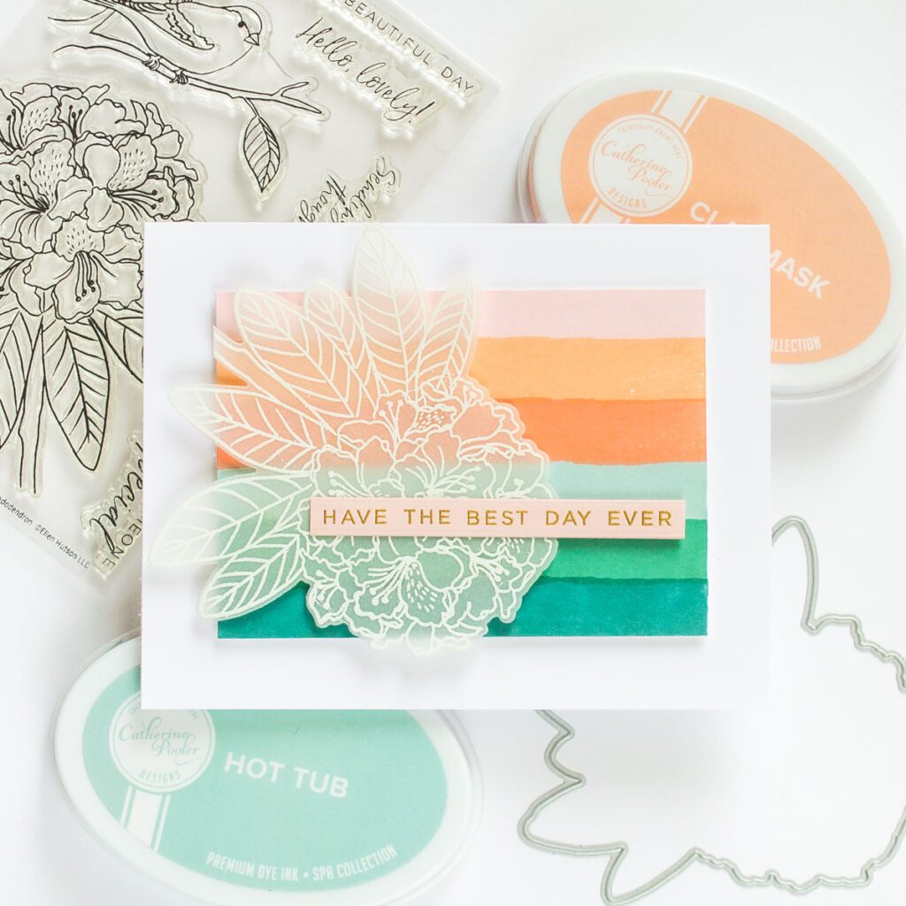
These combinations are made up of 6 colors each, and feature Catherine Pooler, Concord & 9th, and Pinkfresh Studio inks. (Of course, feel free to swap in others from your stash.) I started with 3 pretty conventional spring floral colors – pale orange (CP Clay Mask) pale pink (C9 Ballet Slipper), and sage green (CP Sage) that could have easily been used together, but I split them apart and went in very different directions with each of the 3 groupings.

I’ve used the Essentials by Ellen Painted Stripes stamp set, as well as the Essentials by Ellen Mondo Rhododendron as the floral in my examples, but any large floral or line art stamp could be used too. The ink colors are all listed in the order used vertically down each card.

Color Palette #1
- Pinkfresh Studio Ballet Slipper (could swap for C9 Ballet Slipper, though it has a slightly cooler tone)
- Catherine Pooler Clay Mask
- Concord & 9th Sorbet
- Catherine Pooler Hot Tub
- Catherine Pooler Sea Glass
- Catherine Pooler Bay Breeze
Color Palette #2
- Catherine Pooler Pink Champagne
- Pinkfresh Studio Warm Buff
- Pinkfresh Studio Doe
- Catherine Pooler Hot Tub
- Catherine Pooler Skylight
- Catherine Pooler Juniper Mist

Color Palette #3
- Concord & 9th Stardust
- Catherine Pooler Do Si Do
- Concord & 9th Sorbet
- Catherine Pooler Sangria
- Catherine Pooler Sage
- Catherine Pooler Deck the Halls

I hope these projects give you a few ideas for new color combinations to use in your spring crafts. Of the 3, do you have a favorite? Are there any color combinations you’re feeling particularly drawn to right now?

I really like how you’ve presented these color combos. I especially like Color Palettes 1 & 2. I will be seeking out Clay Mask and Warm Buff to add to my collection because I love their subtle tones. Ballet Slipper is already one of my most used inks! Thanks 🙂