
Wanna hear a strange fact? Back when I started card making last year, I really wasn’t into floral cards. Despite being the proud mum of over 60 houseplants and a regular at my local nursery, floral designs just weren’t my thing. Don’t get me wrong – I loved the way other bloggers made them look, but I just didn’t like the way my floral cards looked. Then this year, things changed.
Eventually I stumbled across several floral stamp and die sets that I fell completely head over heels for. One of them is this Fresh Cut Floral stamp set from The Stamp Market, which comes with coordinating dies. The blooms are modern, easy to arrange on cards, and work so well with a variety of techniques – you definitely get your money’s worth! Today I’ve got 2 cards to share that feature these embossed and die cut images, but the results look very different.

First up is the card made with Color Crush cardstock. This one was definitely faster to create than the second card, and if you wanted to make several with the same coordinated look, the colour variations are endless. The cardstock shades I chose were Orchid, Fuschia, Melon, Citrine, Cactus and Leafy. The white embossing really pops against these colors for a nice bold bloom look.

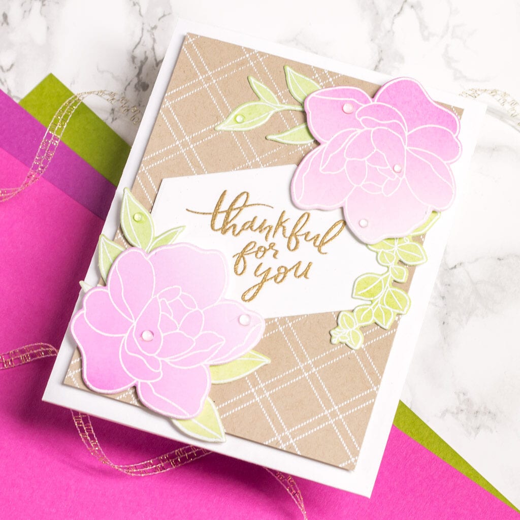
The second card has a much softer feel to it, thanks to ink-blended die cuts. I used my blending brushes along with Color Crush inks in Orchid, Fuschia and Blush to create my flowers, then used Leafy for the leaves. Again, I heat embossed the images on my cardstock with white embossing powder. This time, the embossed lines didn’t have quite as strong of a contrast, thanks to the pale colour palette.

Since the first card had a lot going on colour-wise, I kept the base clean and white. The ink blended blooms needed a little something else though, so I created a background by embossing the Criss Cross Background Stamp on kraft cardstock. For both cards, I wanted the flowers to pop forward so I used foam tape to adhere them to the card panels underneath. The sentiments were embossed with fine gold embossing powder (my go-to!) and to finish, I added a few clear droplets.
I’d love to hear, which look to you prefer? The bold colours in the first card, or the softer ink blended ones?