It seems I’m on a major abstract stamping kick this month, and while I considered whether I really needed to post another one, I just couldn’t resist!
The last Essentials by Ellen release included a whole bunch of really fun celebration-themed products, which is GREAT if you’re a crafter like me whose cards are about 75% birthday-related – aside from the holidays, obviously! This included the new Celebrating You hot foil plate – a single hot foil plate of 18 sentiments that can be cut out in a single pass with the Sentiments Strips die.
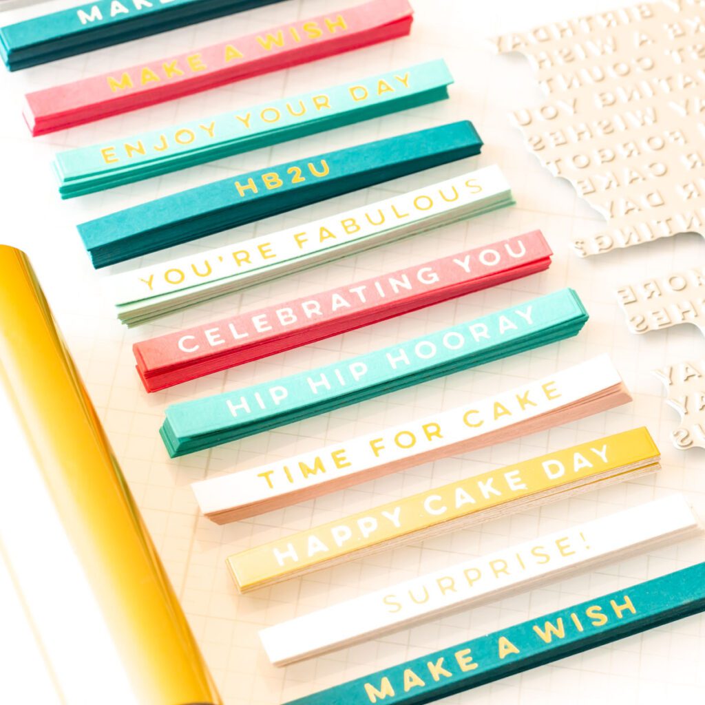
As I like to do after a long day at work when I’m not feeling super creative but still want to decompress away from my computer screen, I made a huge batch of these in various colors and foils. I think it’s safe to say I don’t need to worry about not having sentiments ready the next time I need a birthday card!
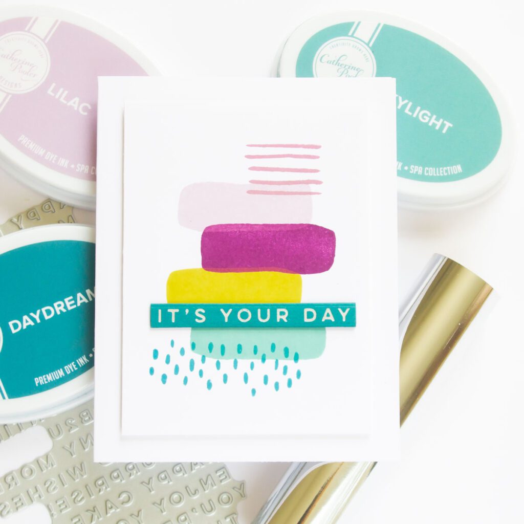
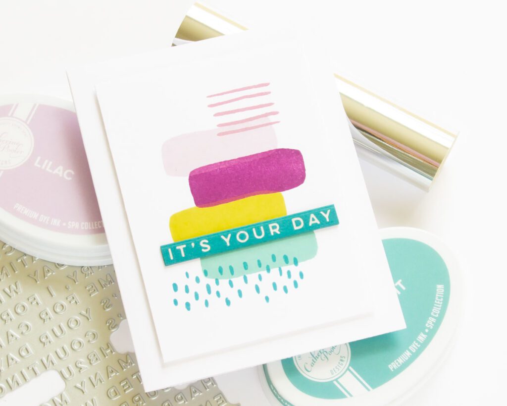
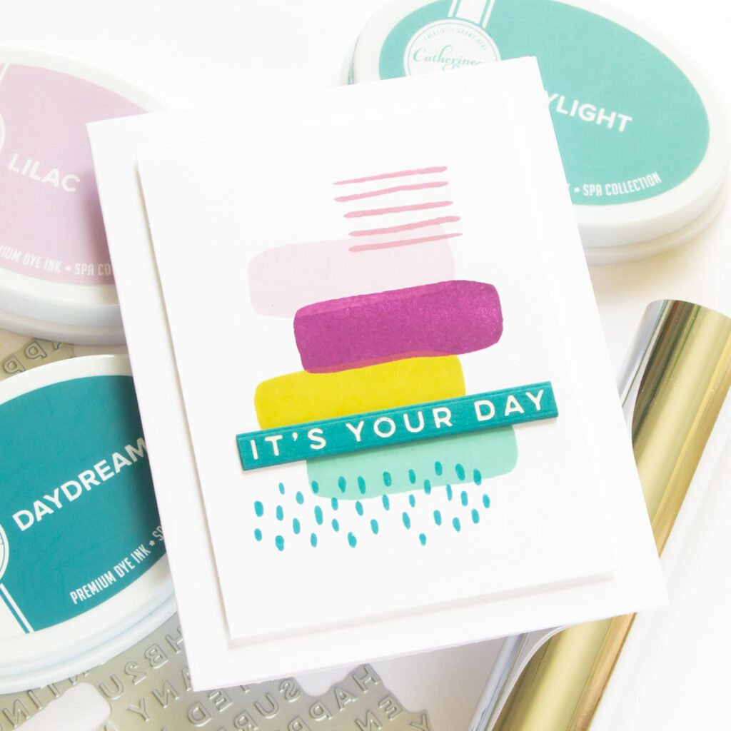
To make the card I’ve got for you today, I reached one of my evergreen, tried-and-trues: the Essentials by Ellen Organic Elements stamp set. I use this one a lot when I want to play with color, and in this case, the following ink palette was speaking to me:
- Catherine Pooler Lilac
- Catherine Pooler Sugared Lavender
- Catherine Pooler Glam
- Catherine Pooler Skylight
- Catherine Pooler Daydream
- Concord & 9th Stardust
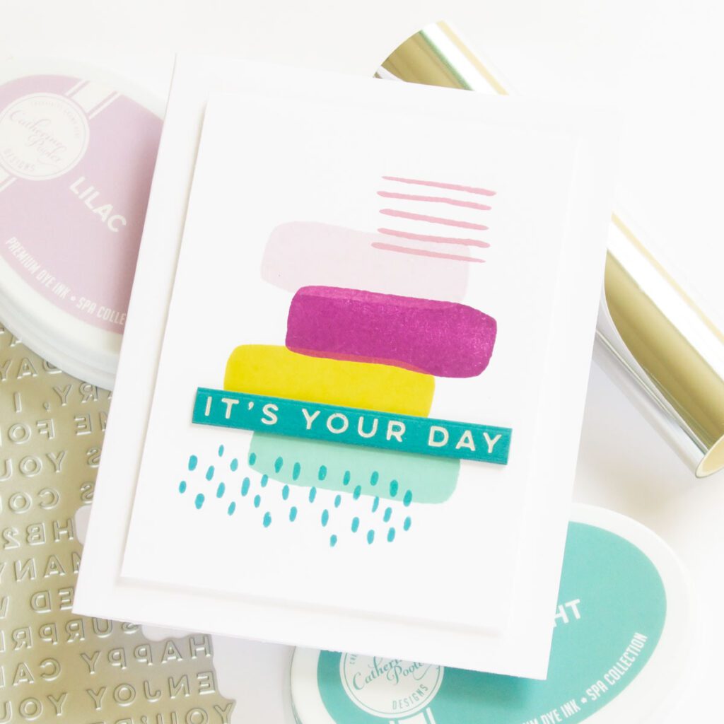
Thankfully, one of my pre-made silver sentiments on Concord & 9th Oceanside cardstock was a great coordinating fit for the blues in my ink palette, so all I needed to do was stack it up on a few more layers and trim it to size. (Note, I like my foiled sentiments to have a lot of contrast, and if you like that look too, Concord & 9th Peacock makes the foiling stand out even more as it’s darker.)
When it came to the stamping of this card, I used a few of my go-to design and color concepts for the layout:
- Odd numbers: There’s 7 elements on this card, including the sentiment. Odd numbers are more interesting and tend to draw the eye more than even numbers.
- Rule of thirds: Designs often look more balanced when elements are arranged on a grid divided into thirds, and the eye is drawn to the intersections of the vertical and horizontal thirds. For this reason, I positioned the sentiment towards the bottom third of the card.
- Balance and alignment: As you can see, my stamping isn’t symmetrical, which might be what your mind goes to when you think of alignment. Each of the images has visual weight (some light, some heavier) but lighter elements are in the top right and bottom left. Despite not being symmetrical, the design still has balance.
- Repetition: The organic stripe is repeated and randomly zig-zagged down the design. This sort of repetition helps to emphasize the random, organic arrangement.
- Complementary colors: A color theory conversation should probably be a post in itself, but I decided to use purple and yellow here as complementary colors, with the blues thrown in…. just because I really really like them!
I could (and do!) stamp these types of card panels for days because they’re so easy to turn into cards for any occasion. They’re also a great way to practice composition skills, which is something that I always enjoy working on. I’d love to know – do you think about design principles and color theory when you create? Or do you a go-with-the-flow type of crafter that makes decisions purely based on what you feel looks good in the moment?
Disclaimer: This post contains affiliate links and by purchasing products through these links, I earn a small commission. Thank you so much for supporting the incredible companies I’ve partnered with.